There are some websites that are stunning; they are aesthetically beautiful and invite us to pause and gaze. As web designers, we strive to create such rich and pleasing sites in order to draw viewers in and beguile them into a prolonged and fruitful visit. However, new web developers will often feel daunted by this task and wonder how they can go about this. What precise elements, colors and configurations combine to produce a gorgeous website? A minimal exposure to design will offer some guidelines in terms of color, white space, balance, contrast, and typography. In this post, we will journey through three amazing websites that have won awards at awwward.com, and analyze them in terms of the above elements. I will limit myself to commenting on their home page in the interest of blog length!
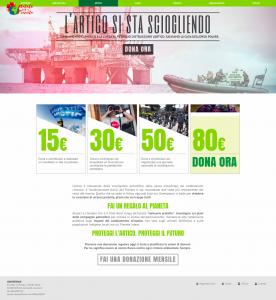
The first is an Italian Greenpeace site at https://sostieni.greenpeace.it/campagna/nataleperilpianeta. This site is specifically to solicit donations for the various Greenpeace campaigns. Generally, sites directly asking for money seem to me somewhat vulgar and removed from more lofty aesthetic considerations. I deliberately chose this site as a wonderful example how design can be artfully practiced even on a page made for the sole purpose of solicitation, although I concede that asking for donations benefiting a worthy cause certainly is far less crude than other types of solicitations.
This site uses a light green color for its navigation header, and the same green for quantities of money to donate in the middle of the page, as well as two lessor text headers toward the bottom, middle portion of the page. The green color evokes the colors of the forest, healthy foliage, and the green, blue earth, as well as being the color of money (at least dollars). The green at the top, then at the middle, and toward the middle bottom creates balance in terms of color on the page. The background is white while the text on the page is a dark grey. The main headline of the page is a very dark green, almost black, which again complements the lighter green of the header. The text is nicely contrasted with its background, which makes it easy to read and differentiates it from the content of the page.

In terms of balance, it should be noted that the header and the text form the shape of an inverted pyramid nearly symmetrical on both sides. The header and image are the width of the entire page. The four boxes showing different donation amounts are centered beneath the image and take up approximately 50% of the page. The text underneath is also centered and is progressively thinner, ending with a grey monthly donation button, which forms the tip of the pyramid. All of this content is firmly planted in the light grey footer that takes up the entire width of the page. The diagonal lines are repeated in the boxes showing quantities, as there is a part of an image in each of these that is cropped diagonally.
There is one image in the header, right under the green navigation header, for each of the Greenpeace campaigns: agriculture, arctic, climate, forest, water, and ocean. Each image depicts devastation of that particular resource. The images evoke old black and white photos tinted in different tones, sepia, blue, red, which combined with the fact that they show nature images, form the association with photo journalists or nature photographers, those who celebrate nature or seek to expose abuses. The images inside the boxes asking for a certain amount of donation are also very apt. They each depict people pushing for solutions to the problems faced by the environment, through activism, research, and outreach.
While the main images offer similarity to pre-digital photography, the typography is a crisp, modern sans-serif font. This is an easy to read font, and perhaps is meant to get us to think of the future of our planet.
Finally, the buttons, or calls to action, are delightfully rendered, and maintain the website’s color balance. The top navigation links, which are in white text, maintain the color of the text upon hover, but the background darkens to the same dark green as the main headline. The boxes calling for donations create a nice movement effect, where the text scrolls horizontally and disappears to be replaced by a large dark green text stating, “Donate Now” (in Italian). In the monthly donation button, which is grey text and outline with a white background, the text goes white upon hover and the background becomes light green, matching the navigation bar at the top.
The second website is Sound Spa at https://naturesoundspa.com/ where the customer can buy relaxing nature sounds. This company sells the idea of relaxation so it is fitting that their main colors are green on a clean white background, with a gentle grey text color. We can see the balance in terms of colors in this website, as the top has a thin dark green rectangle across the entire width of the page with white text welcoming us the Nature Sound Spa and a Help menu on the right. Most of the page text is grey, but the dark green is repeated in their logo in the middle of the page, on the prices on their different soundtracks, and the blog links further down, thus punctuating the grey at more or less similar intervals down the page.

This page creates a balance of shapes in a very rectilinear way. The main images, which the user can scroll through, take up the width of the page. The text above the main image lines up with the edges of the first row of images, which in turn line up with the Featured Products text, the Featured Blogs text, and the About Us and Catalogue text at the bottom. The edges of all the different rows of images also line up with each other, thus creating clean lines down the page and allowing the designer to place a large amount of information in an organized way. The fact that there are mostly rectangles lined up with each other might have created for a monotonous page. There are different numbers of images in the different rows, helping to produce variety. In addition, and perhaps more importantly, under the first row of images, they have placed their logo, which is a wonderfully curving and organic green tree (same green as the very top rectangle).
The images complement the page both in color and in content. Most images have predominantly green, blue and white colors. They depict soothing water, women with contented looks listening to headphones, a woman meditating on the beach, a peacefully sleeping woman, and one relaxing in water. All these images sell us on the idea that the nature sounds will relax us and enable us to sleep tranquilly.
On different rows, the image links either light up or dim down upon hover, which is a pleasing effect. On the navigation menu across the top of the page above the main image, the text is in grey, and upon hover the background goes dark green and the text turns white, matching the top rectangle and allowing a good contrast of text upon background. Each link also opens a box below it upon hover showing yet more image links within, giving us a tremendous amount of information and options without having to click through.
I chose the last website because it is the personal site for a web designer and is of interest to all web developers looking to create or enliven their site. This site is at http://www.purplesquaredesign.co.uk/ and is the personal page of Nicola Francis.

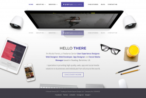
The main image takes up almost the entire page and is of a desk taken from above featuring a desktop computer toward the top with various objects along the sides of the image: speakers on the sides of the computer, a tablet, a cellphone, glasses, a glass of smoothie, pencils, a mouse, a keyboard and track pad. While most of the elements are rectangular, the arrangement of the objects on the desk creates pleasing curved lines, almost like parenthesis enclosing the text that is nestled on the white space in the center of the image. The desk is a very clean and spacious white color, and the image gives us the impression of a person who is definitely at work with all the necessary implements, but who also is very organized and tidy.
The main colors on this page are white, a slightly purplish dark blue, and grey. There is a blue/purple box with nicely contrasting white letters that say “Purple Square”. The word “purple” is in a bold text, while the word “square” is in a lightweight font. This creates a pleasing variety in text types. Underneath the rectangle are the words “Hello There”. Again we get variety both in text weight and color. The word, “hello” is in dark grey and a thinner font that the word “there” which is bolder and the same blue/purple as the rectangle above. Next there is a small paragraph introducing Nicola Francis. This is all in grey except for the phrases “web design” and “mobile app design” which are the blue/purple color, giving variety and serving to emphasize those phrases.
The footer is in dark grey, matching the grey text in the work “hello” and complementing the slightly lighter grey paragraph text. Here I will say the elements on the footer do not contrast very well with the background and the last word of the paragraph that goes onto the footer is very difficult to read. Likewise the button, “discover more” and the social media icons do not stand out very well on the page.
Once I had read the paragraph text and glanced over the footer, my eyes moved back up the page and noticed the white text on the black computer screen (nicely contrasted) which read, “You, but so much better,” a subtle commentary toward the fact that a good web design will emphasize a company’s or person’s real essence but in an extremely flattering manner.
It was only at this point that I noticed the hamburger menu on the top left side, which when we first land on the page sits on top of one of the speakers and rather blends in with it. But this is just a small observation on an otherwise beautiful page.
So, now that we have analyzed several great examples, what lessons can we apply to our own projects? Well there are several ideas we can work with. We talked about balance in terms of color. Choosing colors that complement each other is important, as is balancing these on the elements present by alternating and using color to highlight important information. The images are also vital, in terms of the content they portray, the main color present in them, and the associations and feelings they evoke in the viewer. It goes without saying that all these factors must complement and add to the ideas presented on the site. Balance is important in terms of color but also in terms of shapes and lines. Embedded in the concept of balance is also ensuring that there is sufficient white space to create a harmonious, uncluttered feel. Contrast is essential too. What good is all our information if the user can’t view it easily? And good contrast adds to the aesthetics of the page. Finally, but no less importantly, care should be taken regarding the typography on the page; the font type, style, color and size are all important design elements that can either enhance the site or detract from the design.